Titles share something in common with transitions; they should be used sparingly and not take away from the story being told, instead adding information that explains something the visuals cannot.
Examples include locations, dates, times, people’s names and so on.
The biggest mistake I see with titles is usually the typeface / font being used, followed by colouring or other embellishment.
You need to find a clean and readable font and be consistent with it, not mix and change fonts throughout the video.
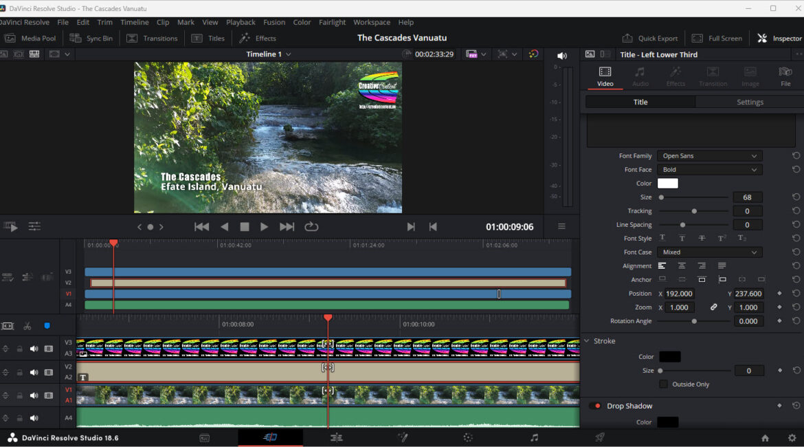
Titles placement is also very important. You want people to be able to easily read and absorb the information, but not have it obscure the imagery underneath. And if the title does not need to be on-screen, remove it.
When I use DaVinci Resolve, I tend to stay with a specific title style (Title Left – Lower 3rd) and use the Impact typeface in white, often with a shadow behind it to offset it from the video underneath.
Another thing I do a lot is to have a watermark at the top right corner of the video. This stops people using and claiming credit for my work. This watermark (some call it a sting) I made in Adobe Photoshop, applied transparency to it and then saved as a PNG image (JPG cannot have transparency).
It is then loaded into its own track, usually the top track, and placed in position.
Any good video editing package should be able to do titles that are satisfactory for your needs. As I have mentioned many times, DaVinci Resolve is my package of choice as it is VERY versatile, available for Mac, Windows and LINUX, and has a free version suitable for most users (the main limitation is the freebie version will not support 5.3K video).
If you need more specialist titling, have a look at products from NewBlue, Borisfx, or BluffTitler.
See also:
